Sunday, 25 September 2011

Analysing Paramore Music Videos

Video 1: Misery Business


I think this video is brilliant and really speaks volumes through the narrative story of it, the colours used and the emotion put into it. It’s directed by Shane Drake who has also directed Decode along with other Paramore videos. This shows that they obviously feel comfortable with him and feel he will get the best result and bring the best out of them.

There is a mix of a narrative story and performance footage in the video, but it’s not live tour footage like we can see in the video for Careful. This song is off the album Riot! And you can tell this really obviously because the set for the performance footage is a black floor and background with Riot! written in white messy style font that matches the one seen on the front of the album cover and it’s also written once in orange too which is the same as the album also. The background looks really effective because it’s black and white so the band really stand out against it. They are strongly advertising the album with the similar art being their background.

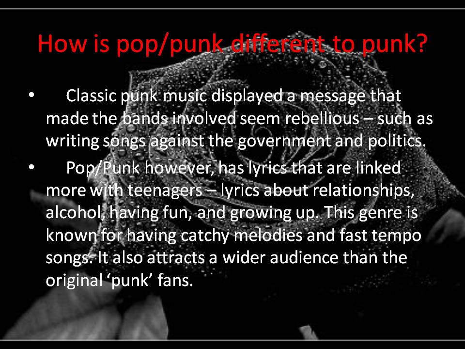
The outfits they wear really fit the genre of pop/punk. They are all wearing black but with red, orange and yellow so it really stands out (Hayley’s hair also matches this with it being bright orange in the video). These type of colours usually symbolise fire, so this could mean they are showing how fierce they are and passionate – this links with the title of the album ‘Riot’ an outburst of strong emotion. The outfits throughout the performance footage is very punk – Hayley is wearing zebra print tights with a different colour for each leg, showing she is different.

There are clips of the band head-banging and jumping around when the guitar solo kicks in and this is very typical of a pop/punk bands videos. The camera work and editing is very interesting in this piece, as they are appropriate to the style of the song. The song is very fast and so there are very quick cuts so there is a flow and the camera clips fit with the song. I think if the cuts were too slow and stayed focused on something for too long, it wouldn’t work very well because the editing would be disjointed from the style of the song. Having said this, there are lots of close-ups of Hayley’s face, but this works because her facial expressions are important as the song has a strong message.

Something else that is really interesting about the video is the narrative that tells a story. It’s set in a school (which immediately gives the impression that there will be ‘drama’). We first see a group of cheerleaders stood in a doorway and there is a very subtle message with the word ‘punk’ written on the wall. A girl bursts through them and walks through in a bright blue dress with a lot of makeup on and looking very confident. We know from the start that she will link in with the lyrics and some of the story does too. She’s so arrogant as she struts through the corridors and one of the lyrics is ‘I never meant to brag’ and I think this is appropriate. I think the spiteful girl in the video depicts the girl mentioned in the lyrics, because there are links to it. Hayley sings ‘when I thought he was mine she caught him by the mouth’ and in the video she kisses another girls boyfriend just to be spiteful. This could portray something that has happened in Hayley’s life in the way that she’s been with someone and then lost them but ‘waited eight long months’ until they were set free, when she got them back.

I think there is a message in the song that the band really don’t agree with being fake and not being true to who you are because Hayley sings ‘Looking as innocent as possible to get to who they want’ but also says ‘I refuse, I refuse, I refuse’. This links to Hayley wiping a cloth against the camera as if it is the girls face wiping all her makeup away, we then see her with it all smudged and the character as a vulnerable girl. The band don’t show any sympathy though, again this could be relevant to something in their own life.
With regards to the conventions of the pop/punk genre, when the band come into the narrative story in the school, they are wearing really casual clothes – just jeans or shorts and t-shirts, which is often seen in these types of music videos.
The lighting is very bright, especially in the school, but also during the performance footage despite the fact they are surrounded by black – there are big lights making it bright that sometimes flash to get a varied effect to the video.

Analysing the digipaks for Paramore specifically...


The colours vary a lot throughout the 3 albums, clearly. Although the font for the band name is the same for their first album ‘All We Know Is Falling’ and their latest one ‘Brand New Eyes’, we don’t see it at all which is interesting but on some of the albums there is a sticker on the CD case which has their name on in the same font as the other two albums.
On the back of the Riot! album, there are a photo of the band, but it’s in black and white with the same cartoon style effect as the font on the front. I think they decided to not have a picture on the front because they didn’t want to take any attention away from the name of the album and what it stands for. Hayley has supposedly said that ‘Riot’ stands for a strong outburst of emotion and that’s what they felt they had with the album – so I don’t think they would want to distract their audience from that. The largest ‘Riot’ is written in orange, and as it is written in orange, this could signify their fire and passion for the album and what they do.
The album art also links with the name of it, I think. Butterflies are very delicate and fragile, but very detailed and all very different. The title Brand New Eyes, could be saying they have a different view of things now and have gone on a journey, like a butterfly does and then they blossom. Again, there is a light background and a yellow colour used, so the colours are similar to the Riot artwork, although the actual images themselves are very different.
The biggest difference is the All We Know Is Falling album cover, and this could be because it’s their first one. It might seem a bit ‘random’ because it’s a picture of a sofa out in the open, but it was their first album, so maybe as much thought didn’t go into the relevance of it and they were much younger. The huge contrast between this album and the Brand New Eyes album, could be something to do with the fact that they were first with a smaller label, but then signed to a major label, so just because they felt like they have changed as they got older.
Something that does fit with the conventions of the pop/punk genre, is that the band aren’t actually on the front of any of the albums seen, and when conducting the research into the chosen genre, I found that a lot of the album cover I looked at, don’t actually have a picture of the band on the front, so that’s interesting to see.

Extending the genre...

Paramore mainly have links with pop/punk music, is that's what I'm focusing my research on, however, they also have links with ‘emo’ and alternative rock. Taking this into account, I thought it would be a good idea to see what other bands they are associated with and the digipak of some rock bands to make comparisons.
Some of the other bands that Paramore have link with are:
  • Linkin Park
  • Muse
  • My Chemical Romance
  • 30 Seconds To Mars
  • The Red Jumpsuit Apparatus
  • Papa Roach
  • Evanescence

But again, the alternative rock genre is also very varied in its sound. Looking at the album covers for some of these bands, it is clear that they are a lot different to those of the pop/punk genre. The main thing being that they are a lot darker in content and less bright colours are used. Pop/punk have a lot of bright colours. but as seen with the Linkin Park Album and Evanscence album cover, they use much darker colours.


As seen in the two album covers above (Thirty Seconds To Mars and Papa Roach) animals faces of a lion and a tiger can be seen. This could symbolise the fact that they think they are fierce.

Saturday, 24 September 2011

Choose an artist to research (the one you want to produce a music video for) and write a short piece on them.

Chosen Artist: Paramore

Paramore are a pop/punk or alternative rock band from Franklin, Tennessee.
The line up has changed quite a bit with some additions or replacements that didn't stay long. Probably the 'main' line up and one that was most popular was:
Hayley Williams - Vocals
Josh Farro - Guitar
Zac Farro - Drums
Jeremy Davis – Bass
Taylor Yorke - Guitar (added later)

Jason Bynum made an appearance also on guitar but didn’t stay part of the band too long. Taylor Yorke, a friend of the band was part of their writing process and became a member after the Riot album as a guitarist. He is still an important part of the group today. 


Their band is labelled with more than one category of music but they fuse different styles into their music and so the different aspects of it fit specifications of different styles. They formed in 2004 when the lead singer, Hayley, moved from Mississippi and made friends with the other band members through a shared love of music. It is said that they got their name from a band members mother’s maiden name and when they found out what 'Paramour' meant - 'secret lover', they adopted the name.                              
Rehearsing at their houses and starting to write music, they were just having fun, but then they started touring (being driven by parents because they were so young). Since then they’ve only become more popular and have amazingly dedicated fans that know every lyric of every song. They’ve released the albums All We Know Is Falling, Riot, The Final Riot and Brand New Eyes and have been nominated for countless awards. 

Their influences are New Found Glory, Jimmy Eat World, Sunny Day Real Estate, and No Doubt so they have a mixture of pop/punk and ska music. The band is signed by Fueled By Ramen which is part of Warner, but they still supposedly get the freedom to write what they want despite it being a major label. The albums have progressed, I think, but there are a couple of songs from each album that really mean a lot to people and help them through hard times. I think these would be The Only Exception and Misguided Ghosts (the more acoustic and deep songs).

Although Paramore are still together and still going strong, they have faced really tough times. Two of the bands original members, brothers Josh and Zac Farro quit the band unexpectedly last year, and this left some of the fans devastated; many of them were impressed that this huge problem didn’t mean the band split up completely, as Hayley, Taylor and Jeremy carried on and are still creating music.

I have chosen to do produce a music video for this band because I absolutely love them and I’m enthusiastic about the music so I feel I’ll put as much effort and passion in as I can to get the best result. Of course there is also the fact that I need to do a song with a female artist as the person doing the lip syncing. Hayley Williams is probably the most well known female artist for this genre because it’s predominantly male singers, but I genuinely think their songs are really powerful and they would be good to do a lip sync to because you could put a lot of emotion into the miming. 

Friday, 23 September 2011

Conventions of a digipak from the pop/punk genre...

Looking at some of the popular bands in this genre, and their part in music videos, magazines and their albums, there are certain things that are common throughout.

There is usually a certain font that a band choose and then they stick to that and have to same style anywhere the band’s name is shown. For example, the All Time Low name font:

Although these album covers are for different albums, the font and style of the wording for the band name is the same. I think this is an important convention. Also little details can be added to make it more interesting – in this case the skull and exclamation mark.


Bright colours can be seen a lot in this genre – especially the album covers. Something I’ve noticed is that the covers are quite cartoon like for a lot of the bands in this genre, and the band name usually have big bold fonts.
 
The live performance DVD covers:

The dvd covers link in well with the content of the dvd more than the albums do – they have photos of the band on the front and pictures taken of the live performances. Guitars and drum kits etc. can be seen on the back and this is appropriate for the pop/punk genre. An example of this is Green Day and Fall Out Boy:

It’s important to mention on the front where the live footage is being filmed – as seen on both these dvd covers, so it’s clear to the audience.
A list of features need to be put on the back of what the dvd contains (the songs that are sung and anything else).
Also the dvd logo needs to be on there and other things that are seen on a dvd such as the barcode.
Something else I noticed is that the band’s name is written in big letters on the front so that needs to be taken into account when creating my own dvd cover.

Magazine Adverts:

Fashion – very casual clothing is worn – mostly jeans and t-shirts, nothing too formal because that isn’t appropriate to the style of music or how it originated.
A photograph of the band is usually shown.

 
There are pictures of the band pulling silly faces or poses (as seen to the left and right) and  this shows they don’t take themselves too seriously or mind looking stupid.
·         Quotes from the band, a comment about their achievements/success
·         The details of the latest album, when it’s being released or when it was released if it’s already out.
·         The band’s name in a big, bold font.


An important part of the research is looking at the background of the genre - where it started and how it developed. Finding out about the instrumentation is important too. The slides below give a detailed history of the pop/punk genre.


Starting the research...

The first part of the background research for creating a music video, was deciding what genre we wanted to do. We then had to create a mindmap of the chosen genre with the main characteristics of it, because these will need to be taken into account when creating our product as it will have to fit certain conventions.

I decided to choose the pop/punk genre because it is probably my favourite types of music - I think this is because it's mostly fun and upbeat but there is a side to it that is very meaningful and because a lot of the musicians in this genre are quite young, the songs are very relatable.

Here is my mindmap about the pop/punk genre of music: